Broadway Pizza Bar is a local pizza restaurant and bar located in historic downtown Kissimmee, Florida. I came across their website and noticed it did not reflect the experience the restaurant actually offers. I decided to take on the redesign as a personal project rebuilding the site from scratch with a new design system, refreshed branding, and a full online ordering flow. This project is currently still in progress.
Broadway Pizza Bar had an outdated website that did not reflect the energy of the actual restaurant. The ordering system required customers to create an account just to place an order, the branding was inconsistent throughout, and the content was disorganized making it difficult for customers to find basic information.
A full website redesign built around the restaurant's real personality, warm, casual, and rooted in downtown Kissimmee. The new site includes a complete design system, a refreshed brand identity, and a full online ordering flow from browsing the menu all the way to order confirmation.
Design a website that actually feels like Broadway Pizza Bar, inviting, warm, and easy to navigate, while solving the ordering problem that was costing the business real customers.
Successful restaurant and pizza bar websites were studied to understand how casual dining brands present their menu, build personality, and simplify the ordering experience. These insights shaped the color palette, typography, layout decisions, and overall tone of the redesign.
Local Kissimmee residents and downtown visitors aged 25 to 65 seeking a casual dining experience with good food, drinks, and live music.
Nearby restaurant websites were evaluated to assess how they handle menu presentation, online ordering, and brand communication across desktop and mobile.
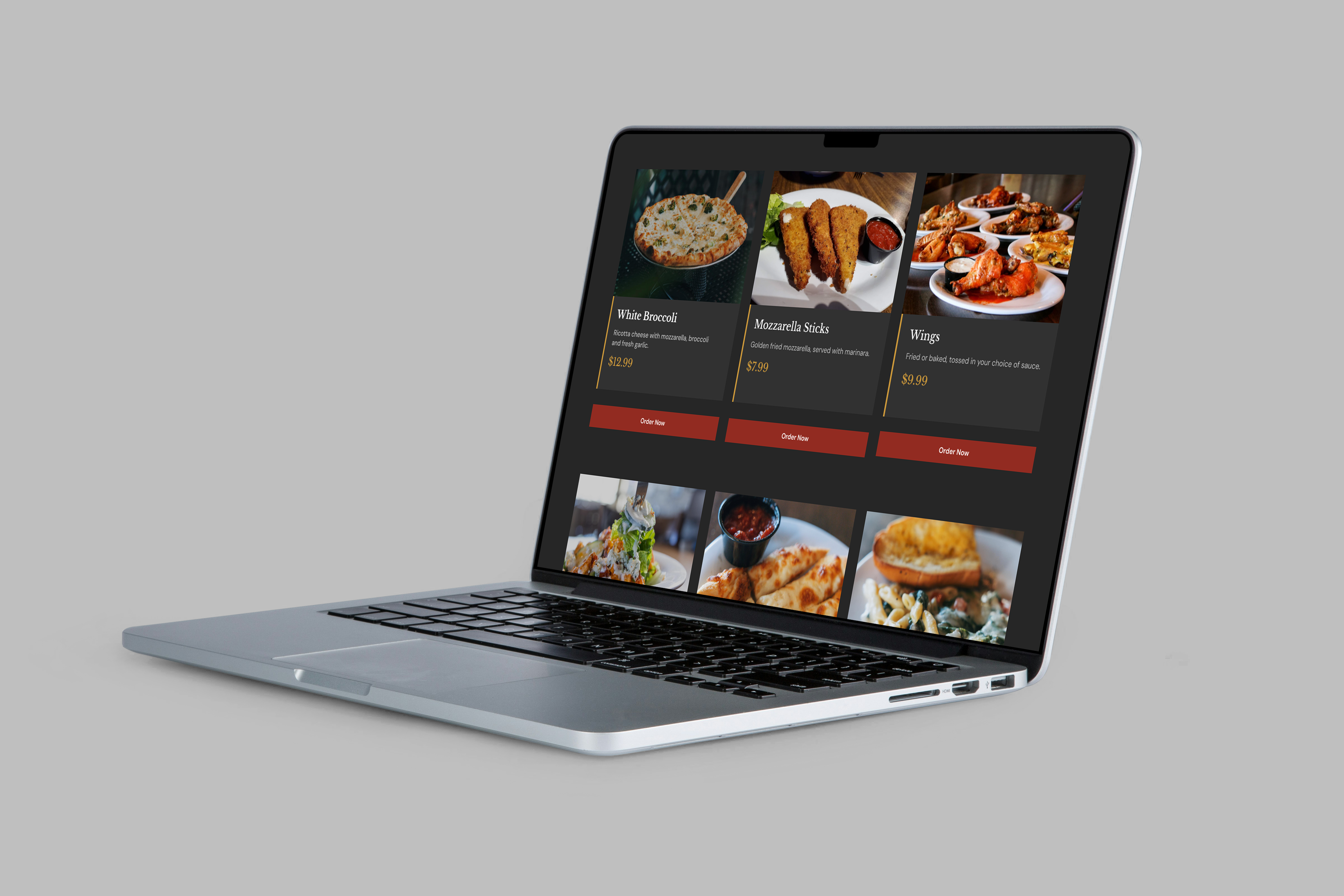
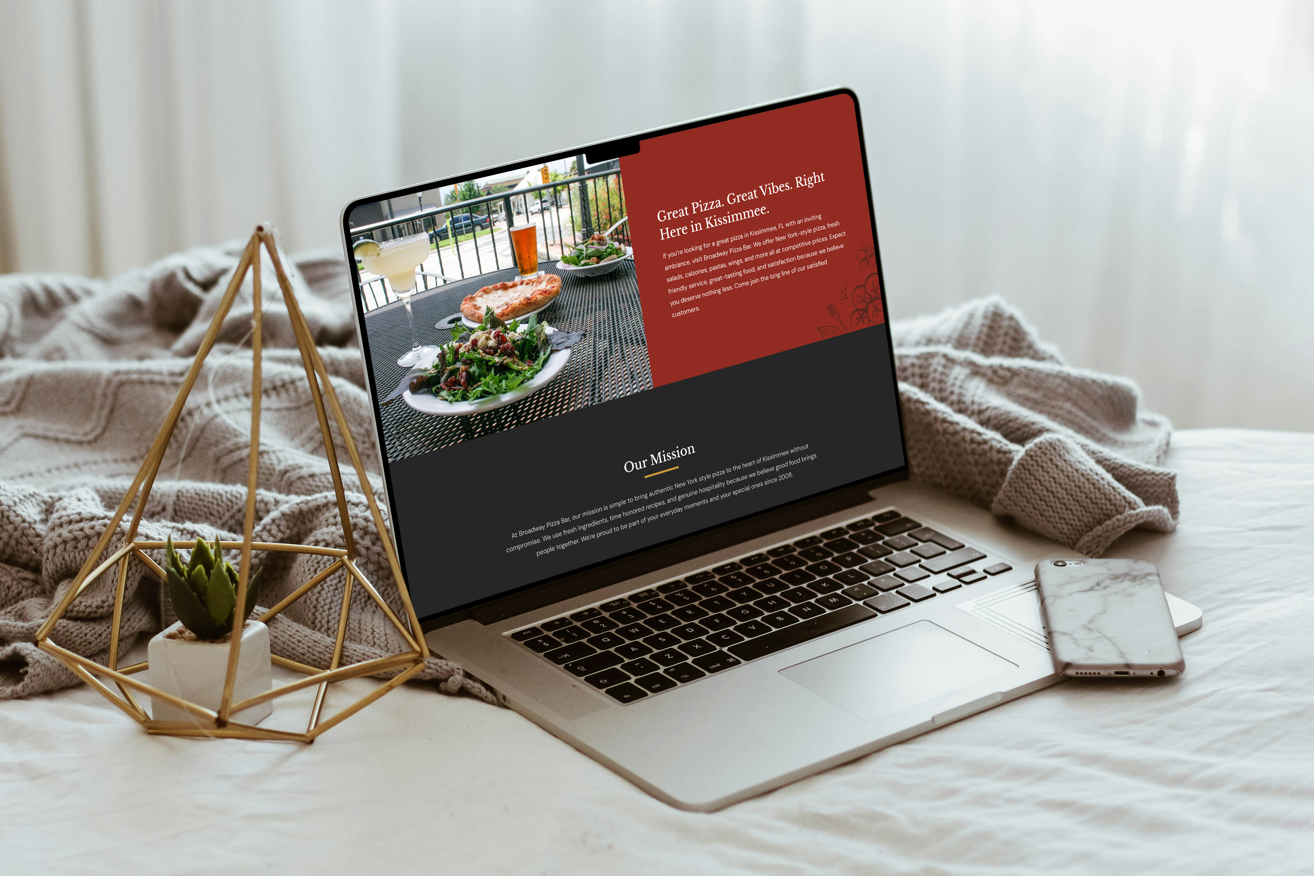
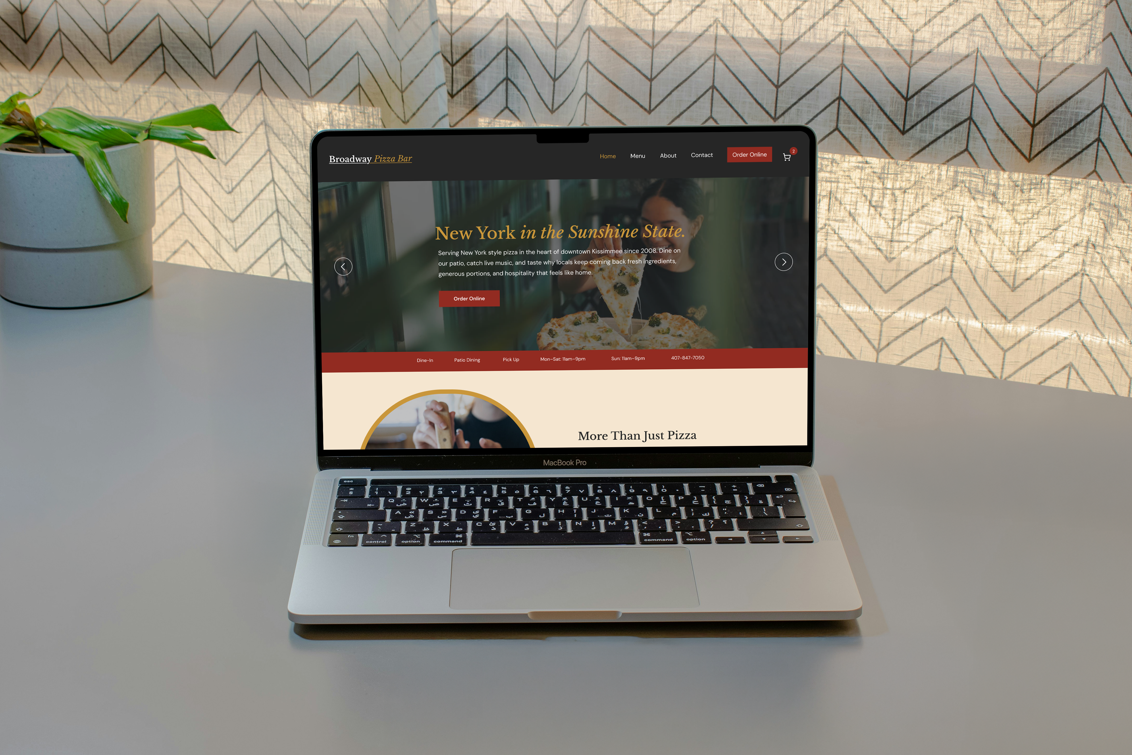
The color system uses deep charcoal, brick red, warm cream, and gold. Libre Baskerville is used for headlines and subheadings, and DM Sans for body text and buttons. The wordmark is purely typographic, matching the simplicity of the physical signage on the building.
The goal was to close the gap between what Broadway Pizza Bar actually offers and how their website was representing it, restructuring the content, building a real visual identity, and creating an ordering experience that does not get in the customer's way.
The full menu was only available as a downloadable PDF. Customers had to download a file just to see what was on the menu instead of browsing it directly on the site.
The navigation only had Home, Contact Us, and Happy Hour with no direct link to the menu making it hard for customers to find what they want to eat.
The online ordering system required customers to create an account or sign in before placing an order, blocking checkout before it even started.
The same About Us paragraph describing the restaurant appeared twice on the same page, once in the main content and again in the footer with no content strategy.
The original website had no clear structure or visual identity. The same About Us paragraph describing the restaurant appeared twice on the homepage, once in the main content and again in the footer. The menu was hidden behind a PDF download, and a login wall blocked customers from placing orders. There was no consistent branding, no design system, and no clear path from landing on the site to actually ordering food.
Before opening Figma, I mapped out the full site structure to identify what pages existed and how the content was organized. This revealed how disorganized the original site was. Sections overlapped in purpose, content was duplicated, and there was no clear path from landing on the site to placing an order.
A full map of the site architecture showing every page, section, and how they connect, from the homepage hero all the way through the checkout confirmation flow.
Wireframes were created for every page before any visual design began, including Home, Menu, About, Contact, Cart, Checkout, and Order Confirmation, establishing content hierarchy and layout decisions early before committing to a visual direction.
The final prototype walks through the complete redesigned experience from landing on the homepage to browsing the menu, adding items to the cart, and completing an order. Every page is connected and the flow tells a complete story from first visit to confirmed order.
The redesign is currently still in development. The screens below reflect the work completed so far including the homepage, about page, menu with full ordering flow, and contact page. The design system, branding, and all page layouts have been established. Final screens and prototype are being refined. A mobile version is planned once the desktop experience is complete.